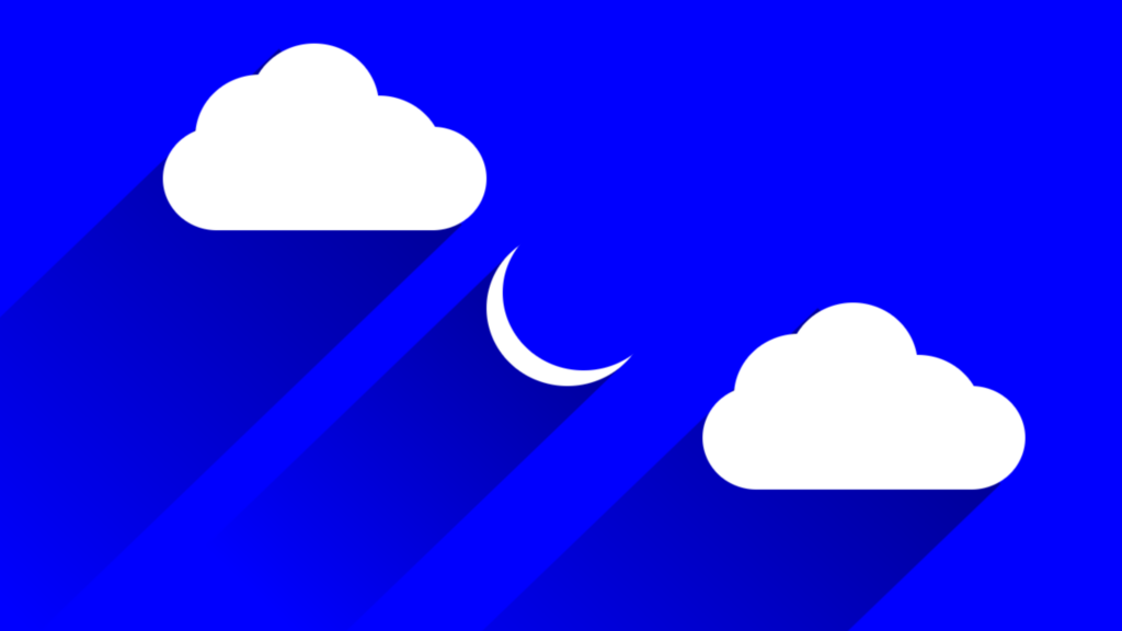
Moon and Cloud code:
1.index.html:
<!DOCTYPE html>
<html>
<head>
<meta charset=»UTF-8″>
<title>Moon and Cloud</title>
<link rel=»stylesheet» href=»style.css»>
</head>
<body>
<div class=»container»>
<div class=»center»>
<div class=»moon»></div>
<div class=»cloud»>
<span></span>
<span></span>
<span></span>
</div>
<div class=»cloud cloud2″>
<span></span>
<span></span>
<span></span>
</div>
</div>
</div>
</body>
</html>
2.style.css:
body
{
margin: 0;
padding: 0;
background: blue;
}
.container
{
position: relative;
width: 100%;
height: 640px;
overflow: hidden;
}
.center
{
position: absolute;
top: 50%;
left: 50%;
transform: translate(-50%,-50%);
}
.moon
{
position: relative;
width: 150px;
height: 150px;
background: white;
border-radius: 50%;
}
.moon::before
{
content: »;
position: absolute;
top: -15px;
right: -15px;
background: blue;
width: 100%;
height: 100%;
border-radius: 50%;
}
.moon::after
{
content: »;
position: absolute;
top: 0;
left: -325px;
height: 100%;
width: 400px;
background: linear-gradient(to left, rgba(0,0,0,0.4)0%, rgba(0,0,0,0)100%);
transform-origin: right;
transform: rotate(-45deg);
z-index: -2;
}
.cloud
{
position: absolute;
width: 300px;
height: 100px;
background: white;
border-radius: 50px;
top: -100px;
left: -300px;
}
.cloud span
{
position: absolute;
width: 120px;
height: 120px;
background: white;
border-radius: 50%;
display: block;
}
.cloud span:nth-child(1)
{
top: -50px;
left: 30px;
}
.cloud span:nth-child(2)
{
top: -30px;
left: 140px;
}
.cloud span:nth-child(3)
{
top: -80px;
left: 80px;
}
.cloud::after
{
content: »;
position: absolute;
top: -110px;
left: -368px;
width: 560px;
height: 240px;
background: linear-gradient(to left, rgba(0,0,0,0.4)0%, rgba(0,0,0,0)100%);
transform-origin: right;
transform: rotate(-45deg);
z-index: -2;
}
.cloud2
{
top: 150px;
left: 200px;
}