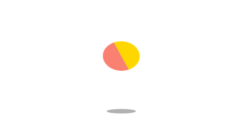
Bouncing Ball Animation code:
1.index.html:
<!DOCTYPE html> <html> <head> <meta charset="UTF-8"> <title>Bouncing Ball Animation</title> <link rel="stylesheet" type="text/css" href="style.css"> </head> <body> <div class="center"> <div class="ball"></div> <div class="shadow"></div> </div> </body> </html>
2.style.css:
body { margin: 0; padding: 0; } .center { position: absolute; top: 60%; left: 50%; transform: translate(-50%, -50%); } .ball { width: 50px; border-top: 25px solid gold; border-bottom: 25px solid salmon; border-radius: 50%; animation: bounce 1s infinite linear; } .shadow { position: absolute; top: 40px; left: 0; width: 50px; height: 10px; background: gray; border-radius: 50%; opacity: 0.8; animation: shadow 1s infinite linear; } @keyframes bounce { 0% { transform: translateY(0) rotate(0deg); } 50% { transform: translateY(-200px) rotate(180deg); } 0% { transform: translateY(0) rotate(360deg); } } @keyframes shadow { 0% { transform: scale(1); opacity: 0.8; } 50% { transform: scale(0.4); opacity: 0.3; } 100% { transform: scale(1); opacity: 0.8; } }
