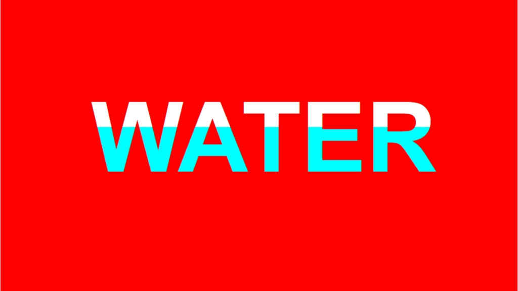
Liquid Animation Text code:
1.index.html:
<!DOCTYPE html> <html> <head> <meta charset="UTF-8"> <title>Liquid Animation Text</title> <link rel="stylesheet" type="text/css" href="style.css"> </head> <body> <h1>Water</h1> </body> </html>
2.style.css:
body { margin: 0; padding: 0; background: red; } h1 { margin: 200px; padding: 0; font-family: Arial, Helvetica, sans-serif; font-size: 10em; text-transform: uppercase; text-align: center; position: relative; color: aqua; text-shadow: 0 0 1px rgba(0,0,0,0.2); } h1::before { content: 'Water'; text-transform: uppercase; position: absolute; top: 0; left: 0; width: 100%; height: 25%; color: white; text-shadow: 0 1px rgba(0,0,0,0.2); overflow: hidden; animation: animate 6s infinite linear; } @keyframes animate { 0% { height: 25%; } 25% { height: 50%; } 50% { height: 30%; } 75% { height: 70%; } 100% { height: 25%; } }

