
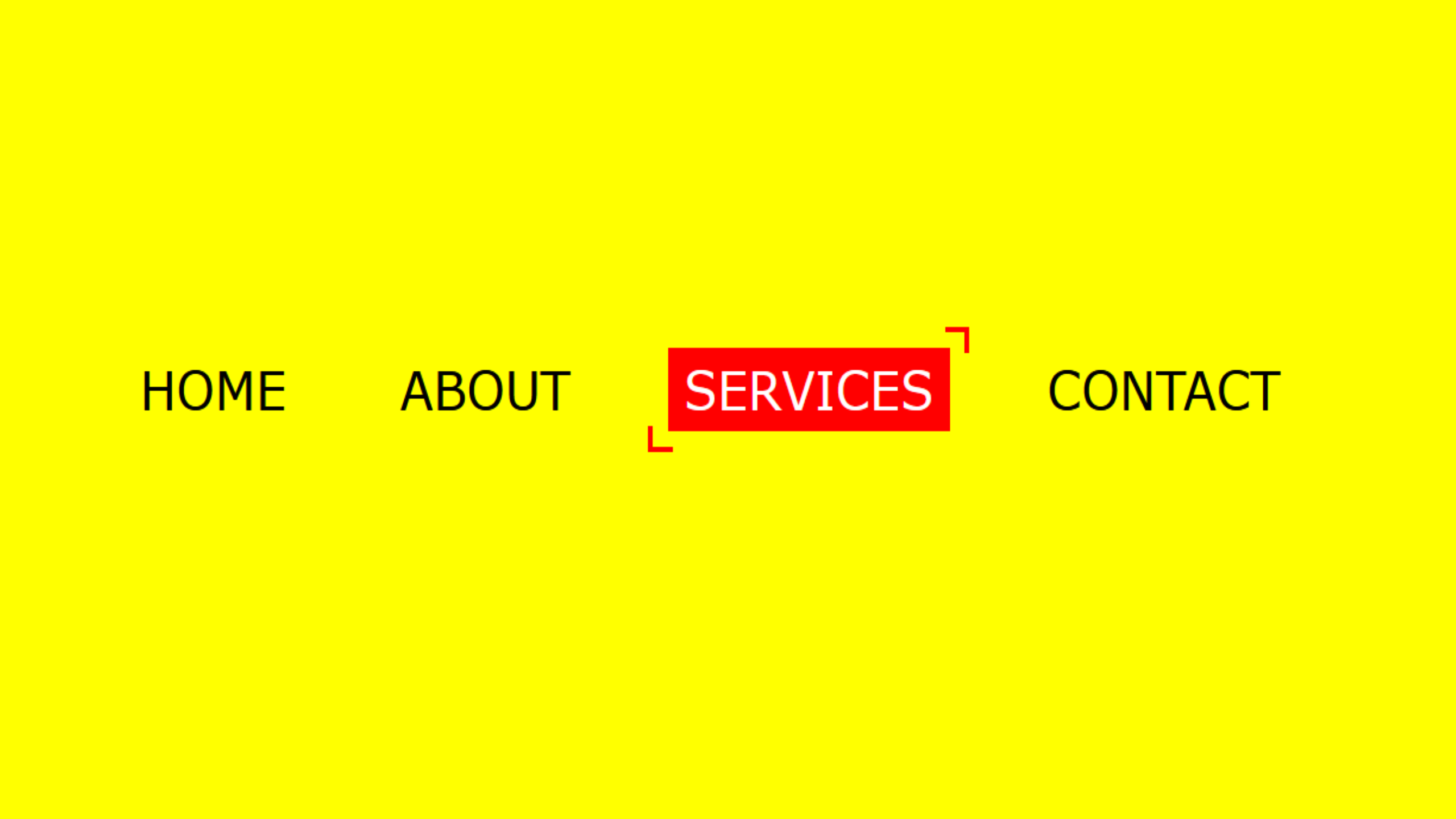
Cool Menu Hover Effects Code:
1.index.html:
<!DOCTYPE html> <html> <head> <meta charset="utf-8"> <title>Cool Menu Hover Effects</title> <link rel="stylesheet" type="text/css" href="style.css"> </head> <body> ¨K0K </body> </html>
2.style.css:
body { margin: 0; padding: 0; font-family: Verdana, Geneva, Tahoma, sans-serif; } ul { position: absolute; top: 50%; left: 50%; transform: translate(-50%, -50%); margin: 0; padding: 0; display: flex; } ul li { list-style: none; } ul li a { position: relative; display: block; margin: 0 10px; padding: 5px 10px; color: black; font-size: 30px; text-decoration: none; text-transform: uppercase; transition: 0.5s; overflow: hidden; } ul li a::before { content: ''; position: absolute; top: calc(50% - 2px); left: -100%; width: 100%; height: 4px; background: red; transition: 0.5s; } ul li a:hover { color: white; } ul li a:hover::before { animation: animate 0.5s linear forwards; } @keyframes animate { 0% { top: calc(50% - 2px); left: -100%; height: 4px; z-index: 1; } 50% { top: calc(50% - 2px); left: 0; height: 4px; z-index: 1; } 100% { top: 0; left: 0; height: 100%; z-index: -1; } }


